Bangkok Bank
Designing a Design System Documentation to Align Design and Development Goals
Role
UI Designer / Lead
Client
Bangkok Bank
Project Date
2022
The Challenge
Persistent roadblocks from inconsistent designs
The Design Team in Bangkok Bank was growing in number and they constantly faced issues with fragmented design patterns, which made it tough for the team to make design decisions with confidence.
I was tasked to lead the planning and execution of Design System Documentation, with the help of multiple team members, ensuring a timely and quality delivery of the project.
The Approach
Framing the problem
To create an effective Design System, we conducted interviews with multiple domains the team. This helped us shape a Design System tailored to the team’s needs.
We conducted interviews with various domain members, including Developers, Product Owners, UX, UI, and Copywriters. These interviews revealed numerous challenges that the team encountered in their daily operations.
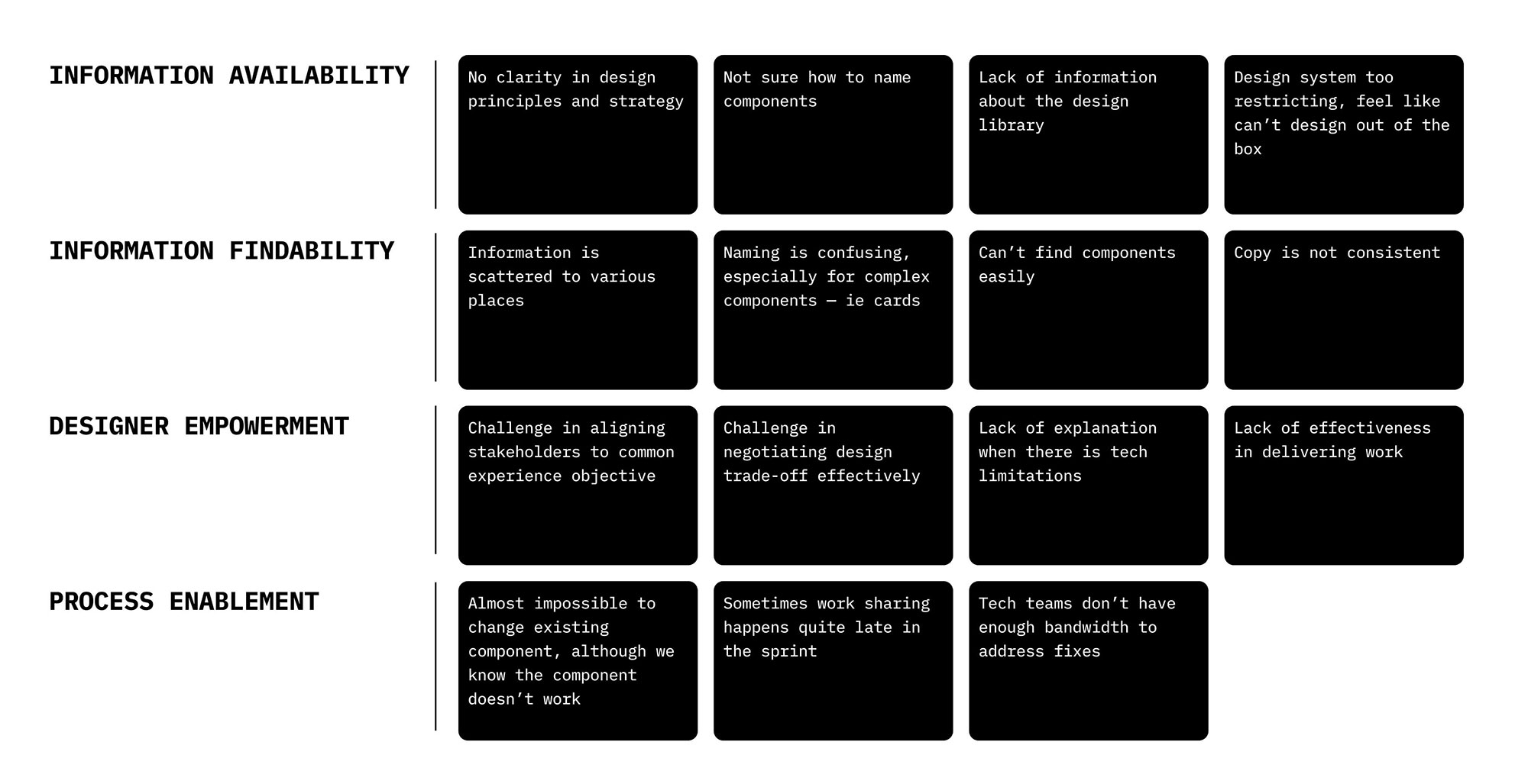
Gathering team’s pain point
We analysed the feedback by grouping them into themes. This helped us spot patterns across user behaviours, pain points, and expectations. We were then able to prioritise improvements and align them with both user needs and business goals.
The Solution
Guiding principles
Using the gathered information, we prioritised the team’s requirements and attempted to formulate guiding principles. These principles were aimed at ensuring that the Design System could effectively tackle the challenges faced by the team.

Centralised Reference
We combined and streamlined different documents into the Design System or, when necessary, provided links to the appropriate documents. This acted as a starting point, offering a convenient reference for all domains and facilitating quicker onboarding for new team members.

Easy to consume
It’s important to avoid creating documents that go unread. We focused on making the documentation easy to understand and keeping content updates straightforward. This was accomplished through a simplified structure and consistent language. Simplified editing was also a priority, making it possible for even non-designers to contribute.

Empowerment
We aimed to make sense of the existing system, define patterns, and document the approved best practices in collaboration with the team. Through these clear guidelines, the team gained the ability to explore and design with confidence.

Collaboration
Since the Design System Documentation is a living document that relied on input from various domains, its purpose was to facilitate collaboration in the pursuit of delivering the best possible user experience in the team.
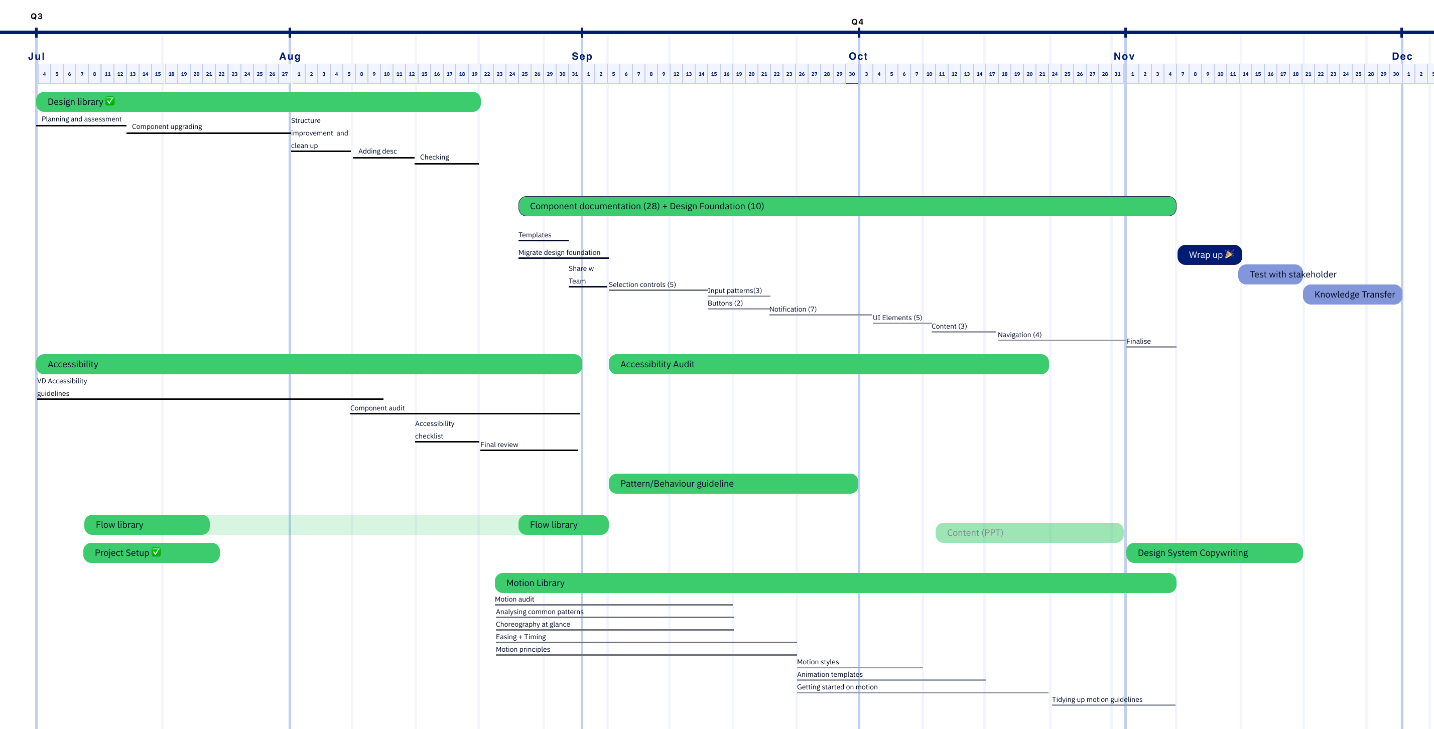
Roadmap
Given that this initiative runs parallel to feature development, we planned to align with key milestones. This endeavour involved the cooperation of several design team members, and we established a weekly check-in schedule with individual teams working on their respective tracks, along with consistent reviews of each other’s contributions.
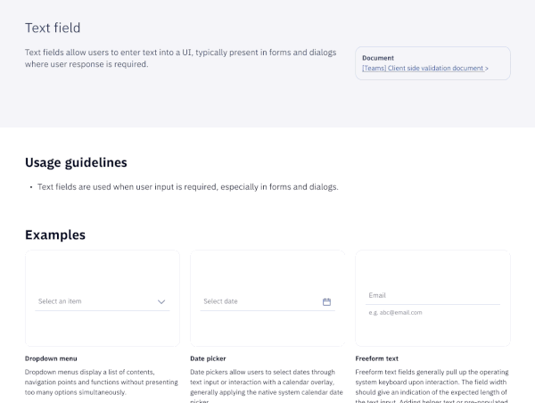
Comprehensive components documentation
Consistency in how components are used and behave has been an ongoing challenge for the team. To tackle this, we have documented the usage and behavior of each component. This documentation empowers designers to make informed decisions with confidence.
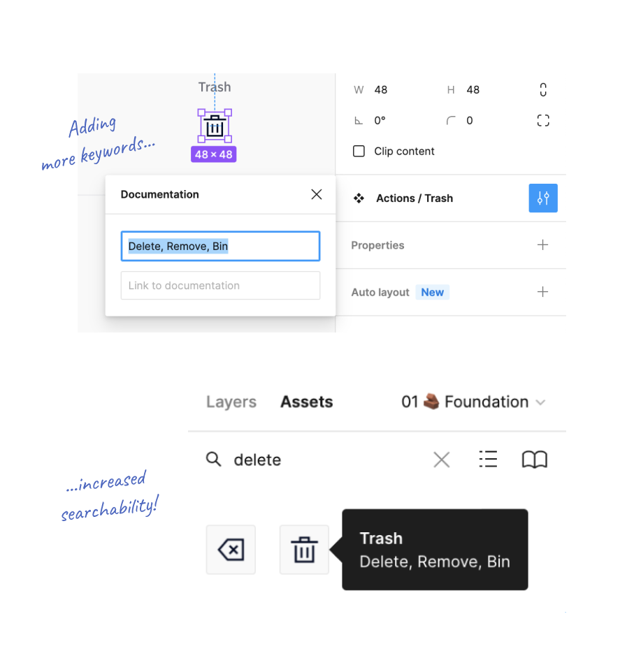
Streamlining and renaming components
When it comes to the icon representing discarding an item, should it be labeled “Trash,” “Bin,” or “Delete”?
With teams spanning different global regions, we’ve recognised the importance of using inclusive labels to maintain easy navigation through a multitude of components. Within our Component library, we’ve integrated relevant keywords to improve their findability.
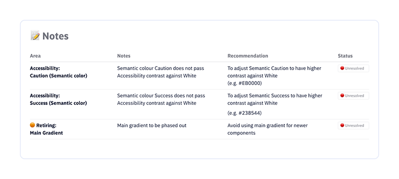
Documenting Known Issues
By merging backlogs and known issues into the component documentation, different domains can now take necessary precautions when designing for a feature.
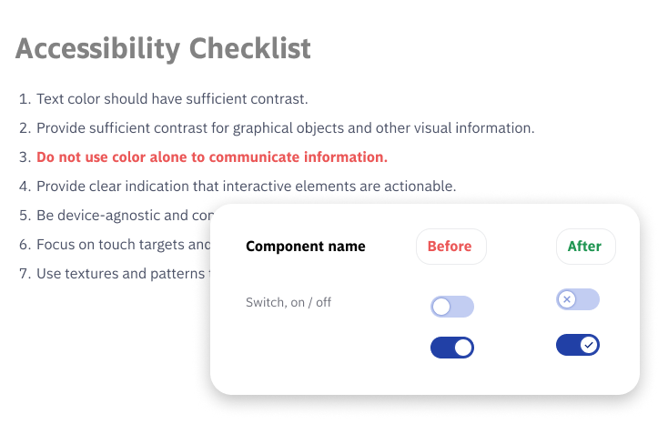
Accessibility audit for inclusive design
Recognising accessibility as one of area of improvement in the current design, a comprehensive accessibility audit was conducted on components and recommendations were made to lay groundwork, so in the future, revision to components can be made.
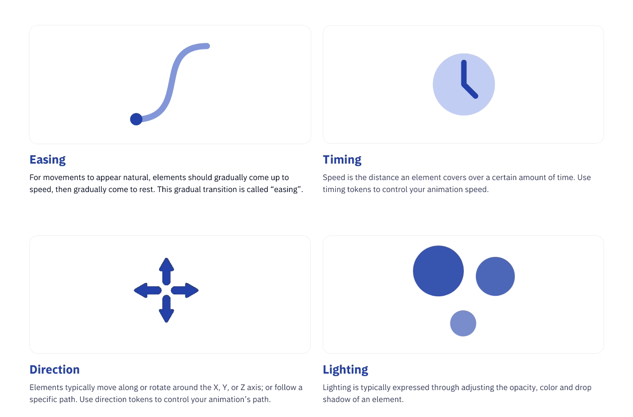
Formulating motion
We developed a micro-interaction formula by deconstructing motion into its purpose, attributes, and tokens. By blending predefined values and offering guidance on their appropriate application, our aim is to simplify the process of creating motion for components, making it accessible to all team members.