HMI Medical
Enhancing A Healthcare Brand Through Smooth and User-Friendly Experience
Role
UI/UX Designer
Client
HMI Medical
Project Date
2024
Background
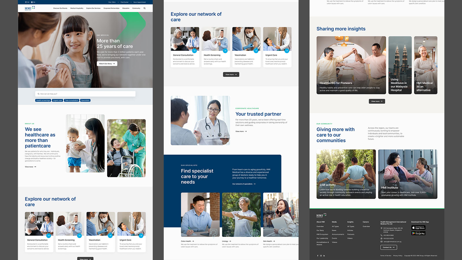
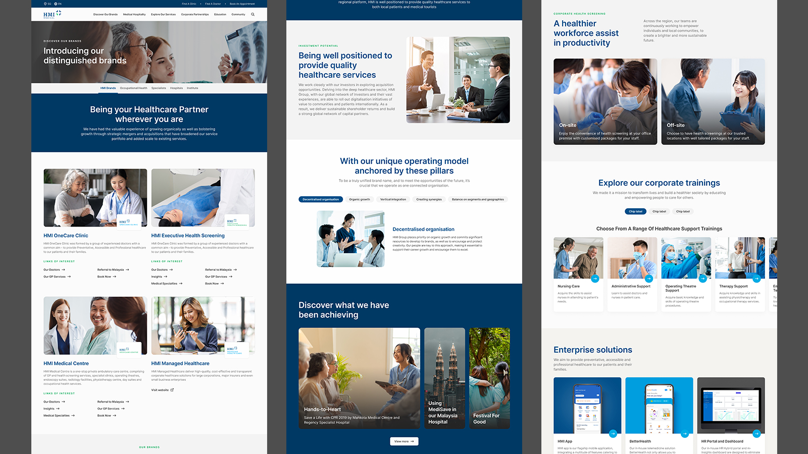
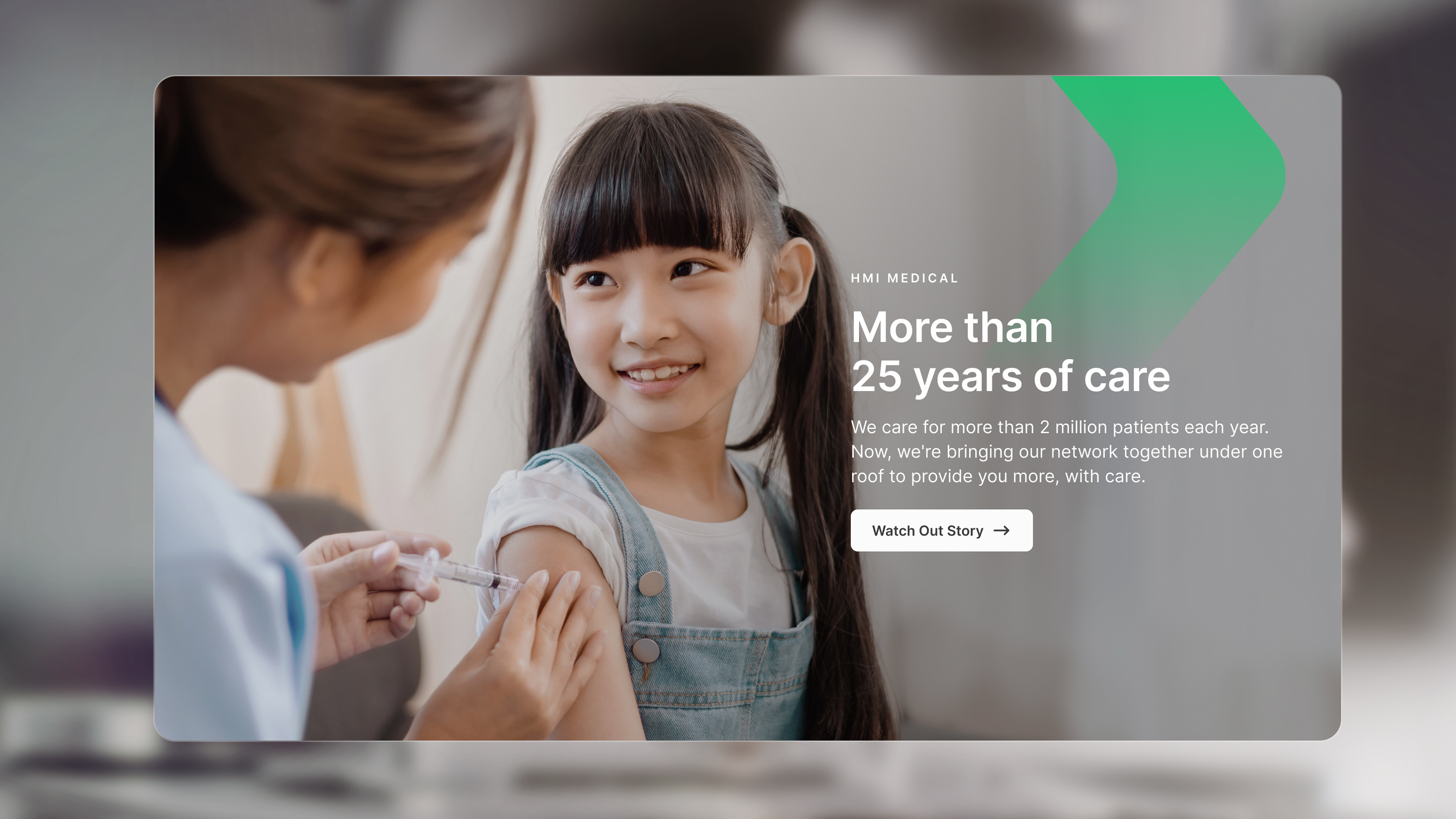
Bringing All Brands Under One Identity
HMI Medical Group is a private healthcare provider in Malaysia and Singapore that owns many healthcare brands in the region. They were undergoing rebranding exercise to bring all the brands together under a single, unified identity.
As part of this initiative, they set out to revamp their corporate website to reflect their new identity.
I was tasked with setting visual direction for the website as well as building the foundation for their Design System. On top of that, I provided various UX support for flow such as Health Screening.
The Challenge
Uncovering Opportunities From The Rebranding
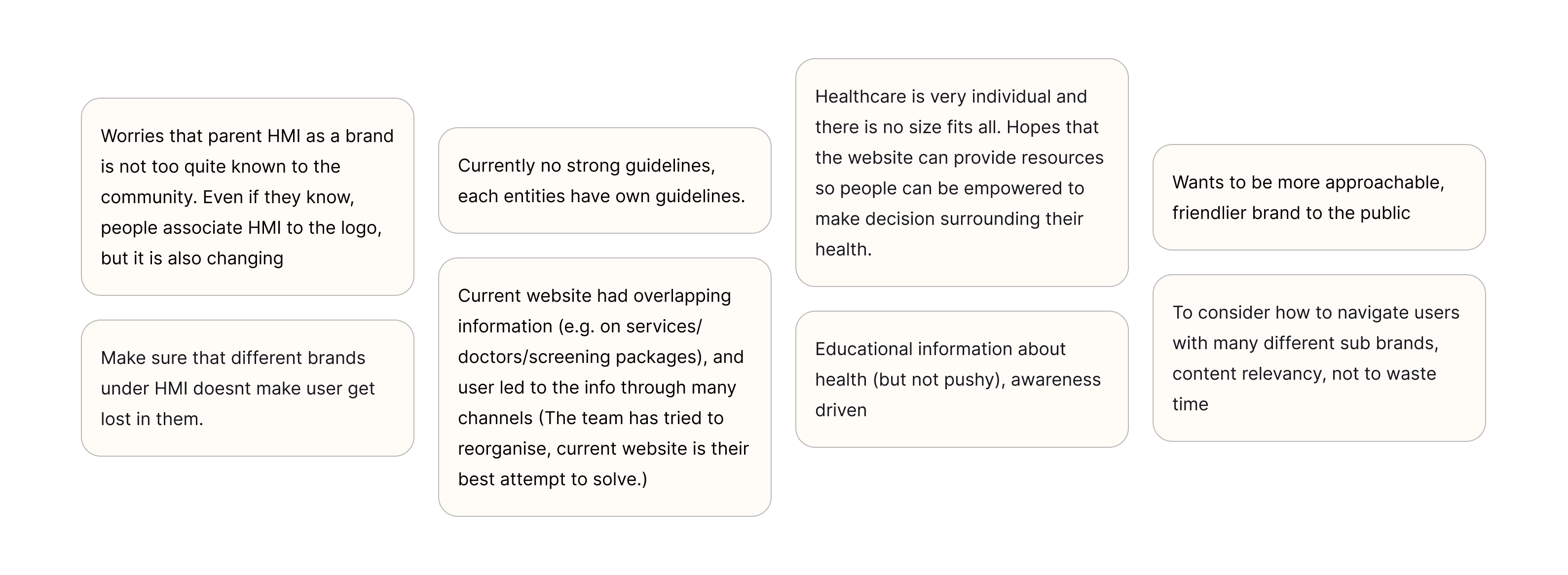
We saw the rebranding as a chance to improve more than just the look of the website, but also revisit the overall user experience. Partnering with the client, we began by speaking with different business units to understand both user behaviour and business goals.
Through user interviews and theming exercise, we uncovered everyday pain points and what really matters to both the business and its users.
The Solution
Elevating Brand By Simplifying User Experience
What is clear to us is that navigating healthcare should be seamless and stress-free.
The interview, heuristic analysis and theming exercise helped us spot gaps in the user journey, unclear navigation, and content overload. From there, we refined the information architecture, cross-pollinate content, improved visual clarity, and designed a more intuitive interface — making the website easier to use and more aligned with what users actually need.
From appointment bookings to product selection, every touchpoint is redesigned with simplicity in mind. By reducing complexity and enhancing clarity, we create an experience that puts the customer first—making healthcare more accessible, efficient, and user-friendly.
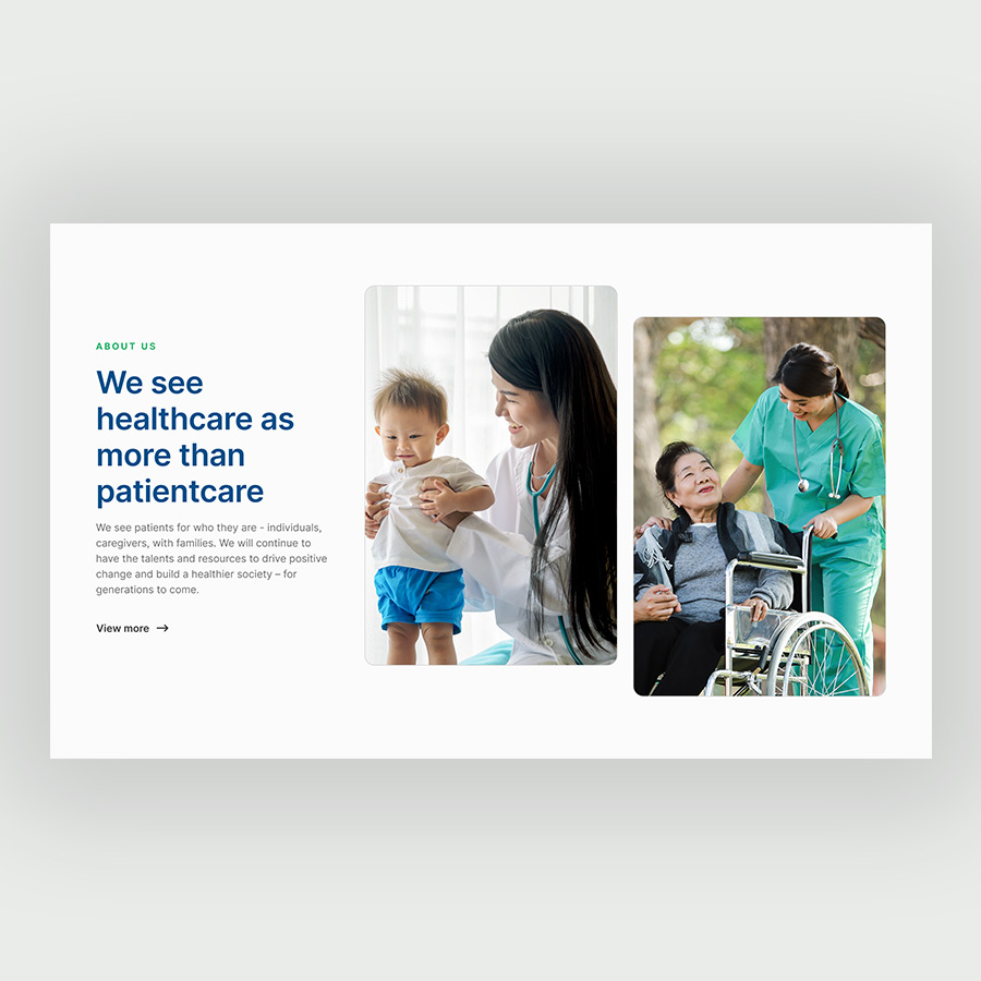
Bringing Human Touch to The Design
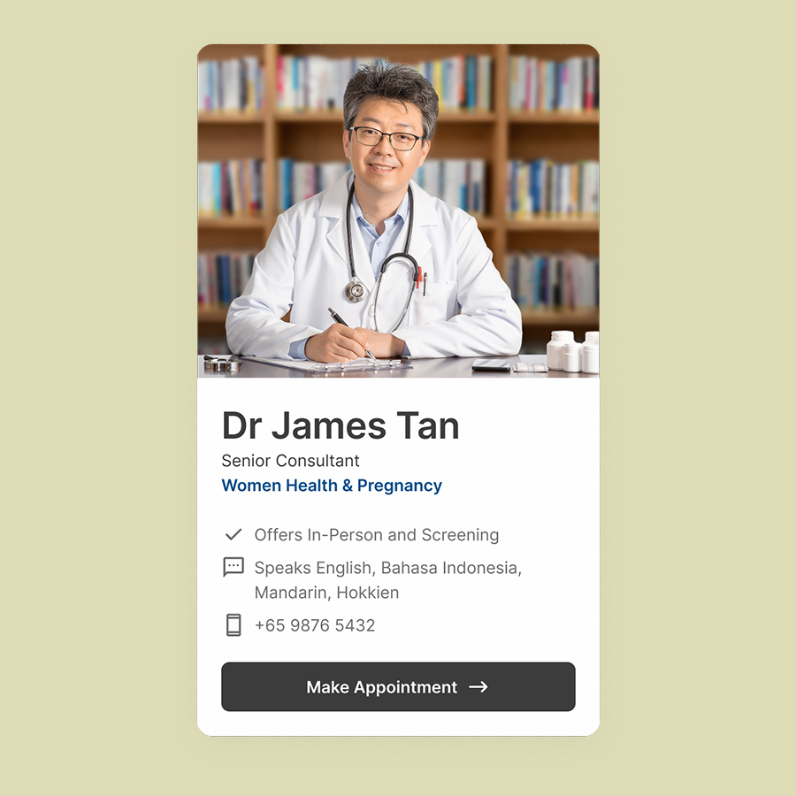
HMI Medical has a rich history and a strong focus on people—both its staff and patients. To convey this, we used carefully curated, warm human-centric imagery, striking a balance between healthcare providers and patients. This helped create a relatable and trustworthy tone across the site.
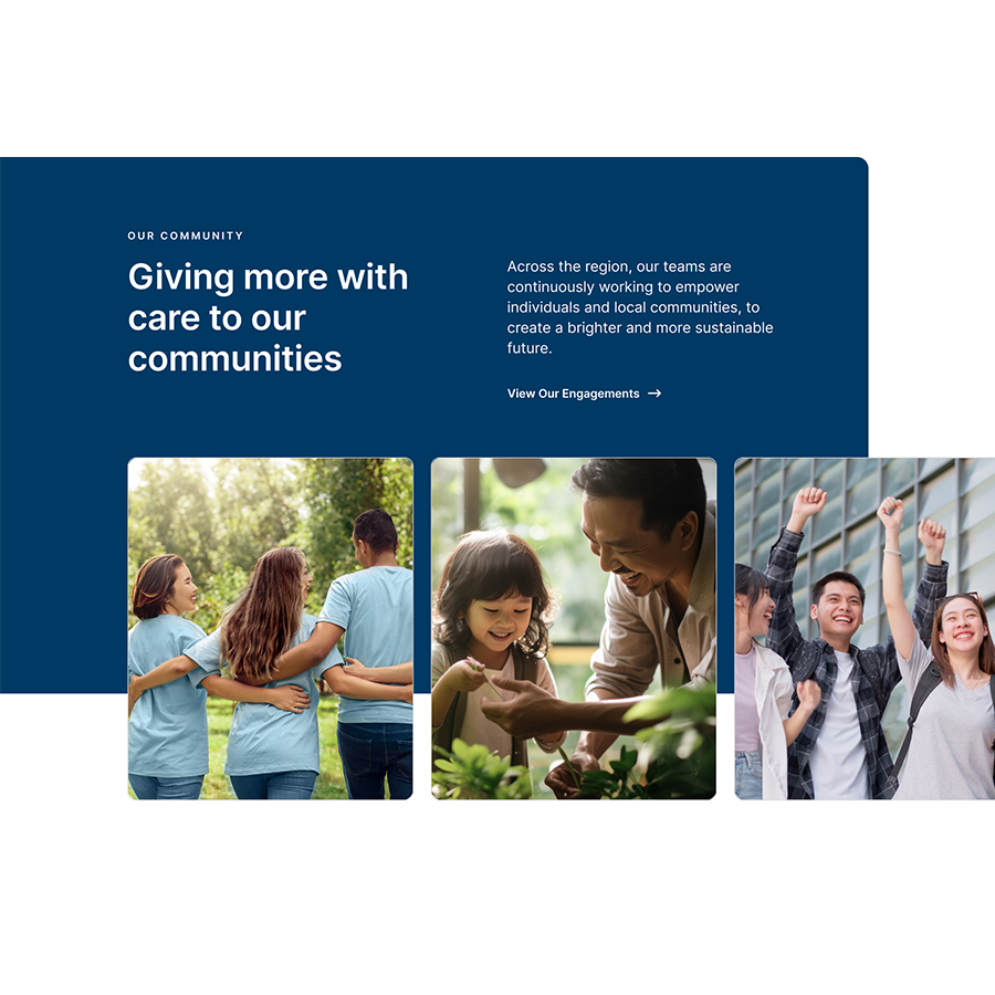
We also designed components with large image areas for content creators to create a compelling visual narrative that enhances storytelling in the pages.
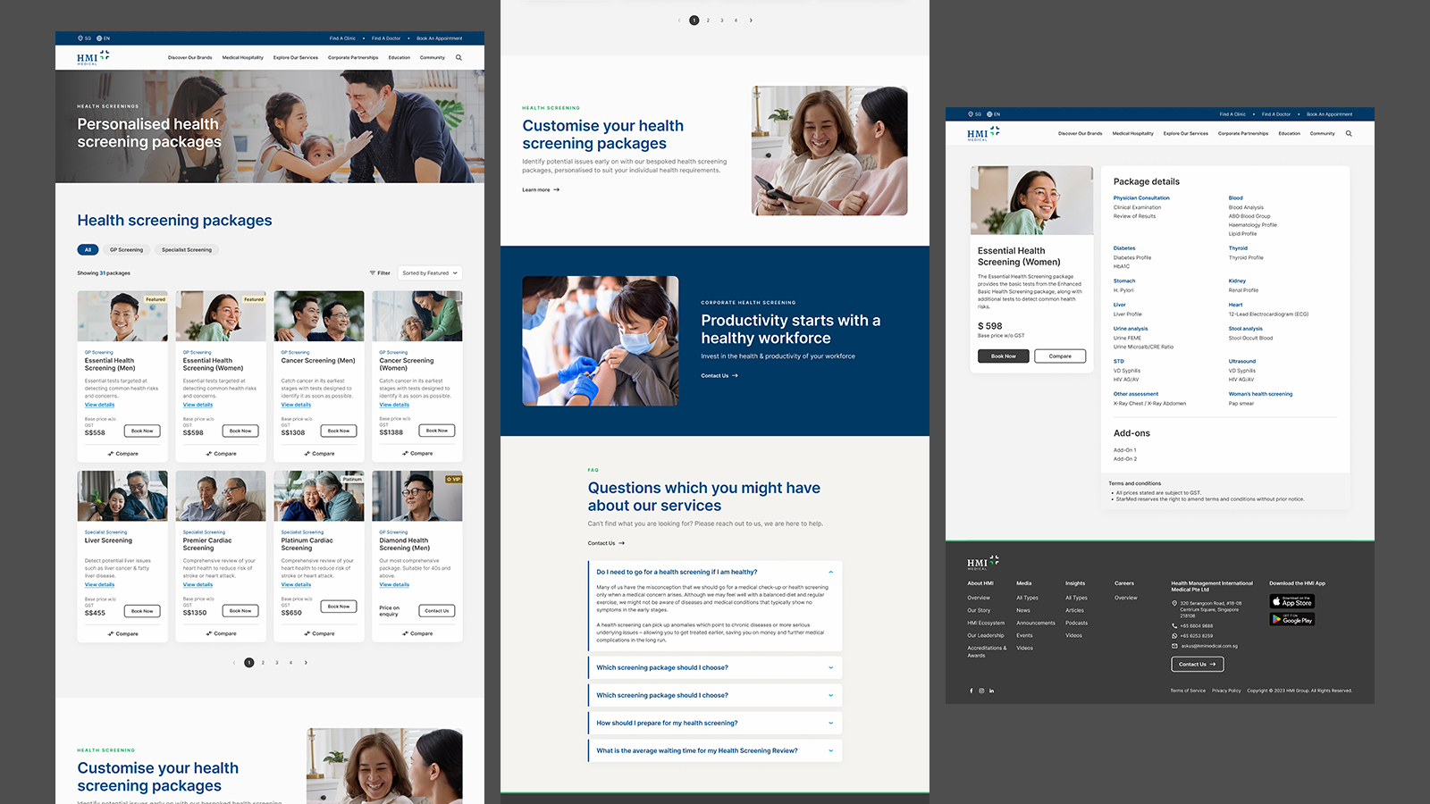
Making Healthcare Retail Accessible
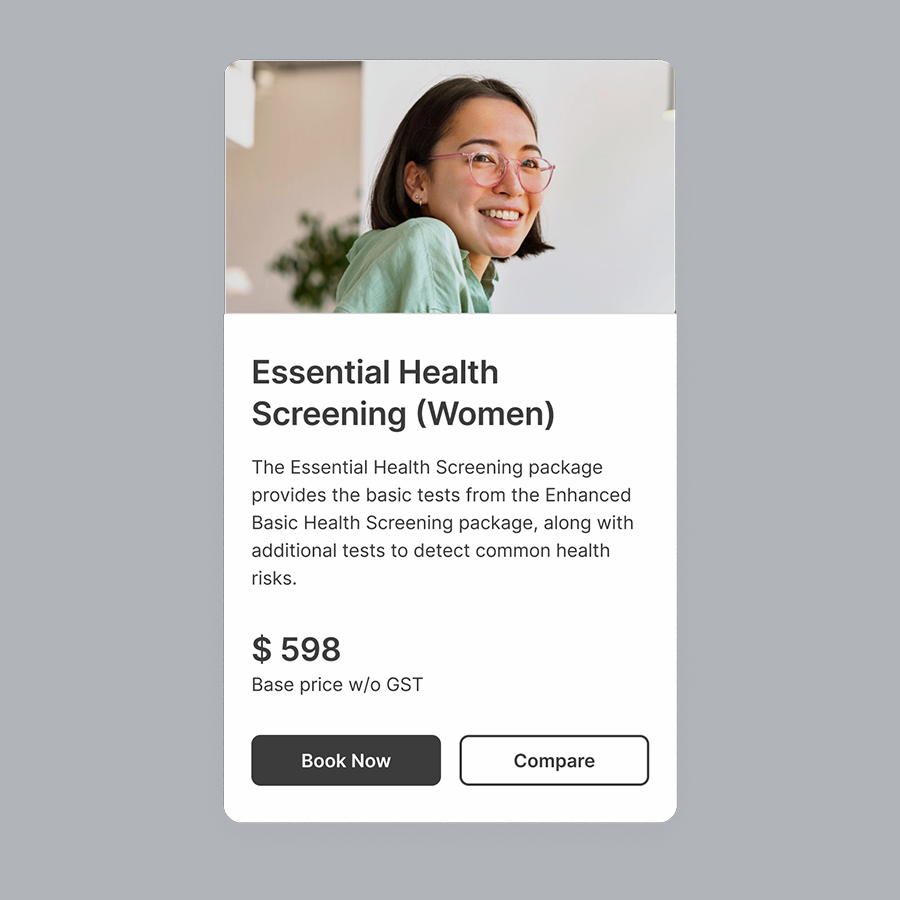
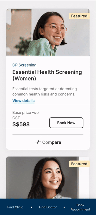
HMI Medical offers a wide variety of health screening packages on its website. We recognised that not only could the sheer number of options be overwhelming for users, but many medical terms and procedures may also be difficult to understand.
To create a smoother product browsing experience, we structured product card information into clear, easy-to-scan sections and organised health screening jargon around relevant areas of concern, therefore contextualising it and making it more accessible to users. Inspired by lifestyle retail shopping, we also introduced a comparison feature, enabling customers to quickly review and compare packages at a glance. This intuitive approach simplifies decision-making, making it faster, easier, and more user-friendly.
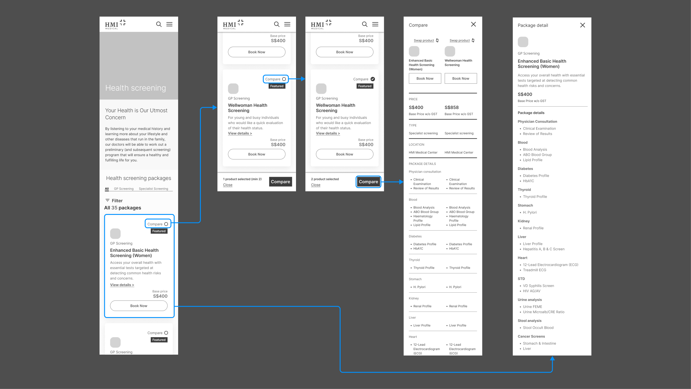
Wireframe of Health Package Comparison Feature
Health Package Comparison Feature Prototype
A Scalable System of Reusable Components, Easily Editable, Thoroughly Documented
While working in parallel with the rebranding process, we took the existing assets and expanded elements like typography and the colour palette to suit digital needs. Since the handoff happened before the new brand was finalised, we also ensured that design tokens and components were flexible and easy to update for future changes.
We also included clear guidelines and clickable prototypes to show how everything should work — so the development team could move forward smoothly, even after we stepped away from the project.
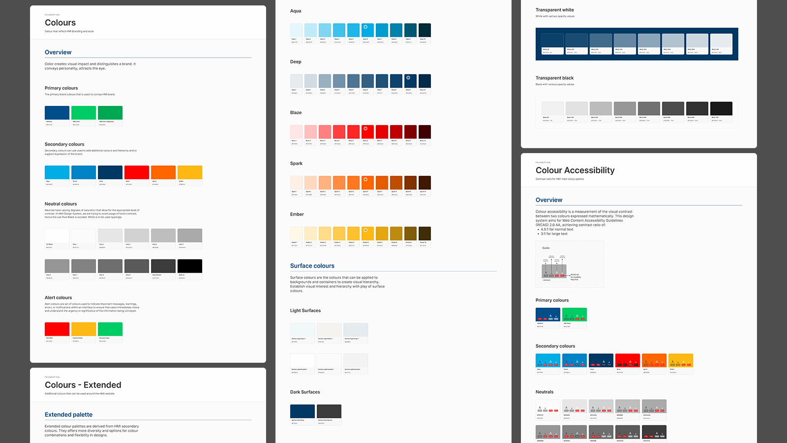
Expanded Colour Palettes and Colour Accessibility Testing from Original Branding Styleguide
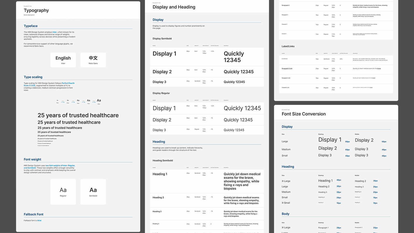
Created a typescale that supports clear hierarchy and easy readability across different devices.
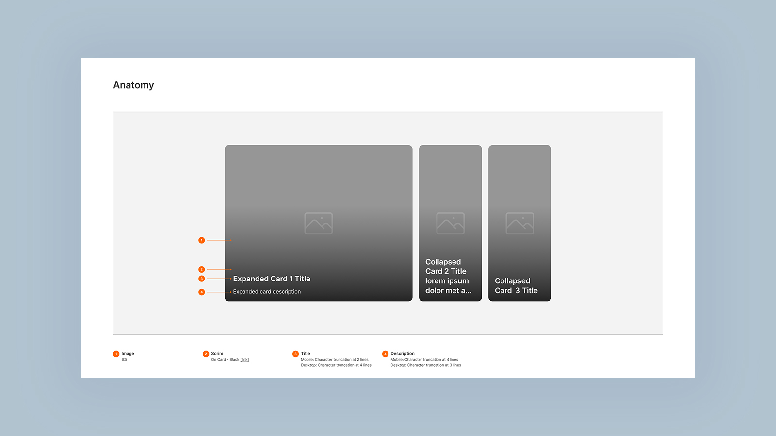
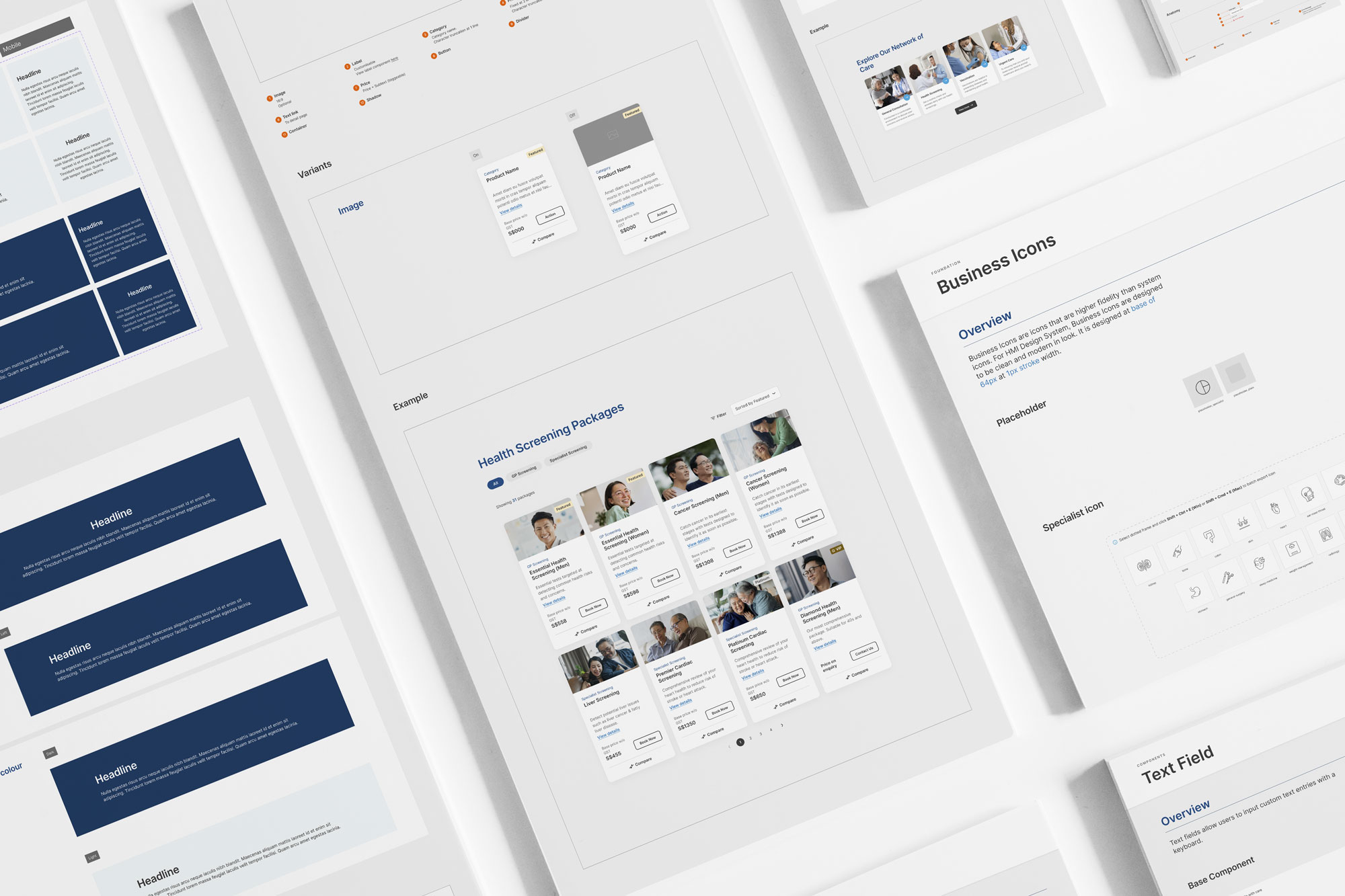
Extensive Component Annotation for Easier Handoffs
Interactable Component-Level Prototype to Showcase Microinteraction and Behaviour
Mock Ups